
A new women's health practice in Greenwich needed an identity from nothing. The category default is cold blue and stock photography, which reads as interchangeable and says nothing about how the practice actually treats people. Everything, name treatment through to the letterhead, had to be built from scratch and had to look established on day one.


Medical & Health · Greenwich, CT
Women’s Health of Greenwich
A private practice identity built to feel calm, not clinical.
Company Branding
Logo Design
Website Design
Print Materials
The Brand Kit
Every file, and what it is for.
A logo is not one file. This is the whole system, grouped by shape and sitting on the ground each version was drawn for, so nobody has to guess which one to reach for.
Stacked
Square-ish placements: signage, print, social, anywhere the width is tight.



Landscape
Wide lockups for anything with a header: the site, letterhead, email.



Marks and elements
The pieces that carry the brand when the full name does not fit.





Palette
Every ground the kit is built to sit on.
The Challenge
The problem we were asked to solve.
Our Approach
What we did, and why.
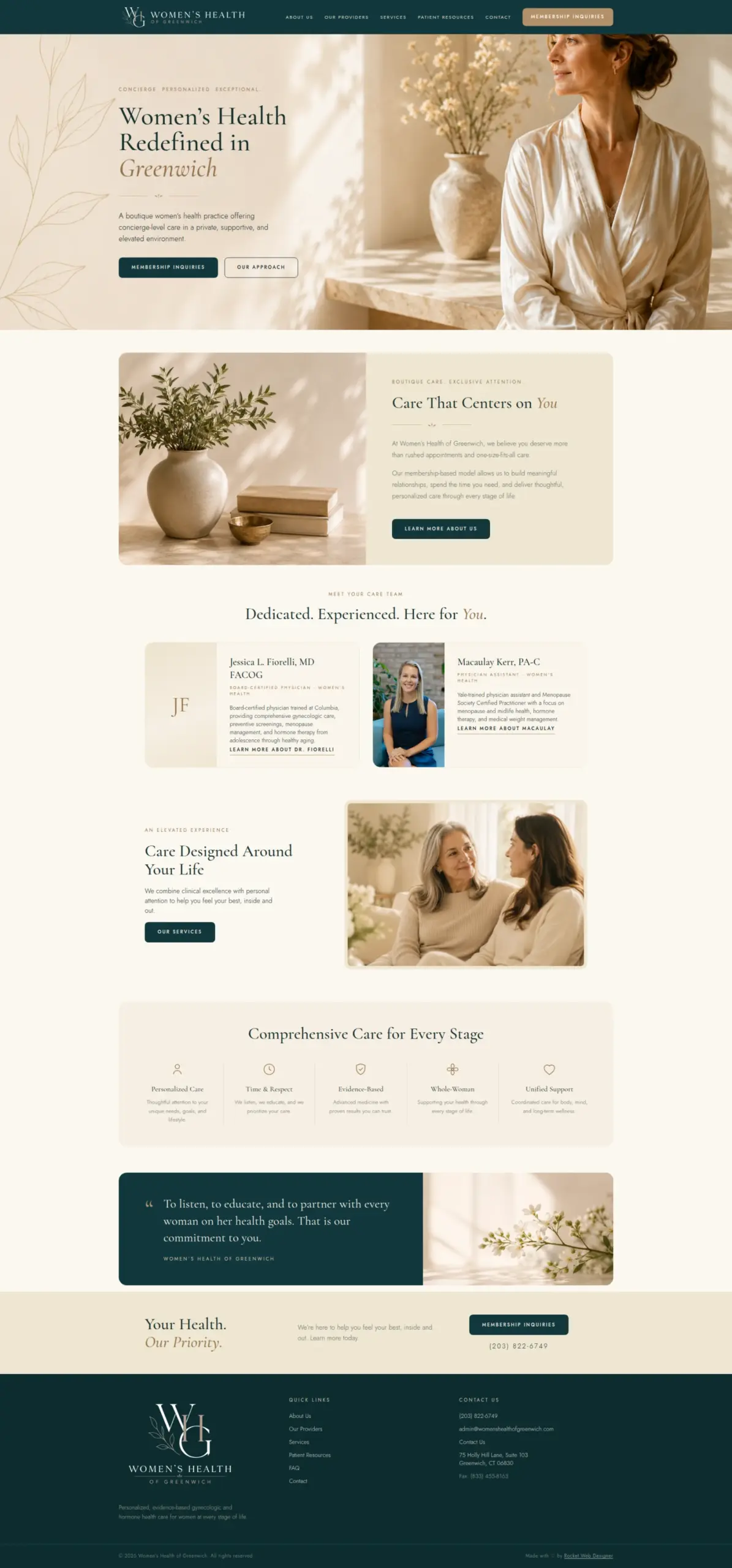
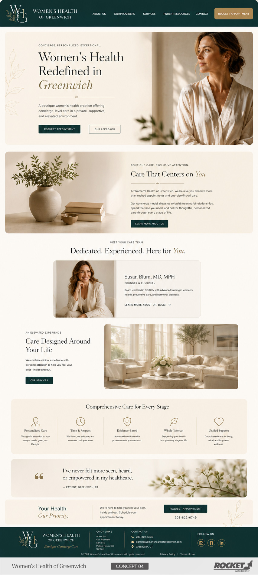
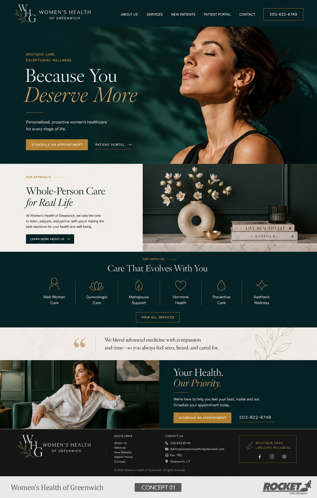
We drew a botanical mark by hand and built the system around it: a monogram lockup, a stacked mark for tight spaces, a full wordmark, and three colourways so the branch works on light, gold and dark grounds without an outline. The palette is deep teal and warm gold, chosen to feel considered and personal rather than clinical. The same system carries into the website, the favicon and the print materials.
Visual Proof
The Work.
Desktop — click to enlarge
Mobile
+

+

+

+

+
More Medical & Health Work
Related Case Studies.
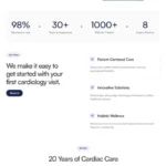
Medical & Health · Pembroke Pines, FL
Cardiology Health
Web Design, Appointment System, SEO
View →
Medical & Health · Greenwich, CT
Greenwich Medical Partners
Web Design, Company Branding, Marketing Print Materials, SEO
Boutique
Practice Website
View →

Medical & Health · Florida
Vickery Anesthesia
Complete
Medical Branding
View →
Free Strategy Call
Want Results Like These
Want Results Like These
For Your Business?
Tell us about your business. We’ll come to the call having already looked at your site, your market, and your competition.