South Florida Is a Vibe & Your Colors Should Be Too
Think bright. Think bold. Think about how your audience feels. Because in a place as vibrant and diverse as South Florida, color isn’t just aesthetic – it’s strategic.
When you understand the psychology of color in marketing, you unlock a deeper way to connect with your customers. It’s not just about what looks pretty. It’s about using color to trigger emotion, shape perception, and influence buying decisions.
Let’s dive into how your brand can harness the power of color to thrive in this unique market.

Real Life Examples: How Color Sells – From Drive-Thrus to Downtown Miami
Color influences emotion before someone even reads a word on your website or sign. Here are three real-world examples, including some familiar faces right here in Florida, showing how smart color choices shape customer behavior in seconds.
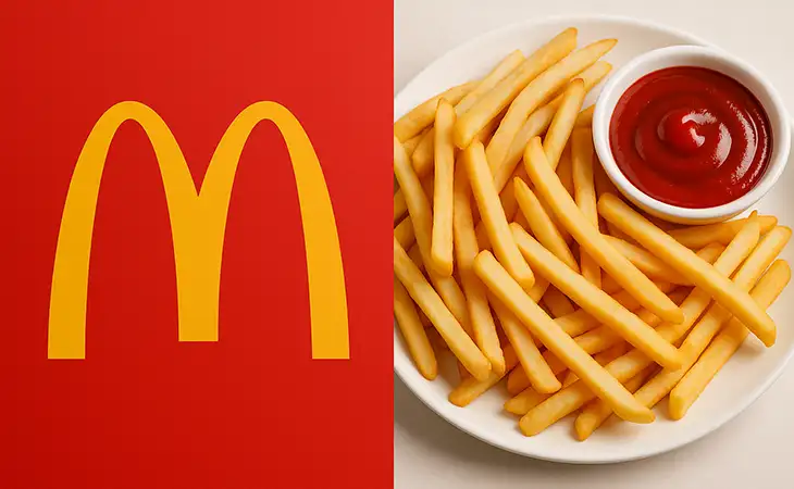
1. McDonald’s: Red + Yellow = Hunger on Cue
McDonald’s bright red and yellow combo works overtime. Red boosts appetite and urgency. Yellow is friendly, fast, and makes you feel happy. Together? You get the visual of ketchup and fries before your stomach even knows what hit it.
South Florida takeaway: Local restaurants, food trucks, and juice bars can use red accents to boost appetite and grab fast attention, especially for window signage and menus.
2. The Salty Donut (Wynwood, Miami): Peachy Pink + Cream = Boutique Indulgence
The Salty Donut built their brand around soft, warm colors, blush pink, ivory, and browns, that feel upscale but still cozy. The tones suggest handcrafted care, sweetness, and treat-yourself energy.
South Florida takeaway: Boutique brands, bakeries, and lifestyle shops can tap into muted pastels to suggest exclusivity without feeling stiff.
3. Joe DiMaggio Children’s Hospital (Hollywood, FL): Blue + Yellow = Hope and Safety
Hospitals can feel sterile and cold, but not this one. Joe DiMaggio Children’s Hospital blends sky blue (trust, calm) with pops of sunshine yellow (hope, energy) to make kids and families feel safer and more at ease.
South Florida takeaway: If you’re in the healthcare, wellness, or education space, blending calming blues with optimistic colors can instantly change how safe and welcoming your business feels.

1. Know Your South Florida Audience
From Miami to Boca to Fort Lauderdale, the culture here is expressive, sun-soaked, and style-forward. That means your color palette should reflect:
Warmth and energy (think corals, oranges, yellows)
Trust and clarity (blues and whites for service-based businesses)
Luxury and nightlife (deep purples, blacks, golds for upscale brands)
Your colors need to resonate with people living in and visiting the area, whether they’re retirees, tourists, or busy entrepreneurs.
2. Color Triggers Emotions That Influence Clicks
Colors trigger emotions fast. For example:
Red = urgency (great for clearance ads)
Blue = trust (perfect for medical, legal, or financial services)
Green = growth or eco-friendliness (ideal for local landscaping or wellness)
When building your CTAs, websites, or social posts, choose color combos that support the emotion you’re aiming to spark.
Want inspiration? Check out how we design high-converting websites for service businesses using color psychology and CTA desig.
3. South Florida Is Mobile-First. Colors Must Pop on Screens
If your CTA button blends into the background on a phone screen, you’re losing clicks. Period.
Choose high-contrast colors for your mobile calls-to-action:
Teal on white
Bright coral on navy
Yellow on dark grey
Tip: Run A/B tests using two different button colors to see which gets more clicks. The difference can be huge.
4. Brand Consistency Builds Recognition (and Trust)
Whether it’s your storefront signage, your email header, or your Instagram grid, consistent color usage makes your brand feel more trustworthy.
Bonus: Consistent branding increases revenue by up to 23%, according to Lucidpress (link for internal reference).
And if your brand colors look outdated or mismatched? We can help with a visual rebrand that aligns with your goals.
5. CTA Color + Wording = Conversion Gold
The best CTA buttons pop visually and use copy that speaks directly to your customer.
For South Florida, test:
Orange buttons that say: “Claim Your Free Estimate”
Turquoise buttons: “Get Started Today”
Blue buttons: *”See How It Works”
Match the emotional intent of the button to the desired action. That’s the real power of the psychology of color in marketing.
Final Thoughts
Be Bold, But Be Strategic
South Florida audiences expect style. But don’t just choose colors you like, choose colors that work.
Understanding the psychology of color in marketing can level up your entire strategy, from first impression to final sale.
Need help bringing your brand to life with color that clicks?
Let’s chat.
Have any questions?
Web Design Services
We are to help answer any questions you might have regarding web design & marketing.
Further Reading
Want to explore more about the psychology of color in marketing? Check these out: