When most people think about web design, they picture colors, logos, or flashy graphics. But what about the spaces between those elements? Designers call it “white space” (or negative space). And while it looks like “nothing,” it’s one of the most powerful tools in shaping how customers feel about your brand.
In this article, we’ll break down the psychology of white space in web design, why it matters for small businesses, and how the right spacing can make the difference between a bounce and a sale.
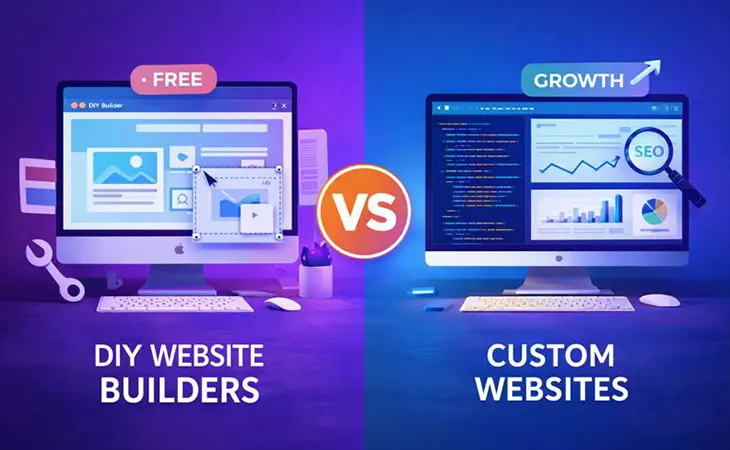
What Is White Space, Really?
White space doesn’t literally mean “white.” It’s the breathing room around text, images, buttons, and sections of your website. Think of it as the pause between beats in a song — without it, the whole thing feels overwhelming.
Good white space:
Guides your eyes to what matters.
Makes content easier to read.
Creates a sense of luxury and professionalism.
Too little white space = clutter.
Too much white space = emptiness and wasted potential.
The Psychology of White Space in Web Design
1. Trust and Perception
Studies show people associate clean, spaced-out design with credibility. Why do luxury brands like Apple lean into minimalist layouts? Because less clutter makes their products feel premium.
If your site crams everything together, it can feel cheap or scammy. White space reassures customers they can slow down and trust you.
2. Focus and Attention
White space creates natural visual “anchors.” A CTA button surrounded by space pops more than one buried in text. Eye-tracking studies prove that users focus better when content is broken into chunks with breathing room.
Want people to click “Book Now”? Give that button room to shine.
3. Emotional Response
Crowded designs make people anxious. Open, balanced layouts feel calm and inviting. For industries like healthcare, finance, or law – where trust and calm are non-negotiable – white space plays a massive role in shaping emotion.
Real-World Examples
Apple: Their homepage could easily cram 50 features in one section. Instead, they highlight one product at a time with oceans of space around it. The message? “This is important.”
Local Contractor Website: We redesigned a contractor site where the homepage was jam-packed with text and stock photos. Visitors didn’t know where to look. By cutting 40% of the content and using smart white space, conversions increased by 35% in 90 days.
How to Use White Space Strategically
Around Headlines: Make key headlines stand out by spacing them away from body text.
Between Sections: Don’t stack sections without breaks. Use padding and margins to create natural flow.
Around CTAs: Surround buttons with breathing room so they grab attention.
In Navigation: Simplify menus. White space between links improves usability and mobile experience.
Common Mistakes with White Space
Overcrowding: Too many elements jammed together. Looks cheap, stresses visitors.
Wasting Space: Minimalism isn’t laziness. Empty pages without purpose feel unfinished.
Ignoring Mobile: White space needs adjusting on mobile. If spacing collapses, your design fails.
Final Thoughts
The psychology of white space in web design isn’t about aesthetics, it’s about shaping how people feel and act on your site. Done right, white space increases trust, reduces stress, and highlights your most important calls-to-action.
If your website feels cluttered, your customers feel it too. Strip away the noise, use space strategically, and let your design breathe. Sometimes, it’s the silence between the notes that makes the music work.
Further Reading
- Rocket Web Designer – The Psychology of Color in Web Design: How Your Palette Impacts Sales – Learn how color choices influence customer decisions and trust.
- Smashing Magazine – Practical Typography in Web Design – How typography and spacing work together to improve user experience.
- Interaction Design Foundation – White Space in Design – A deeper dive into the theory and practice of spacing in layouts.
Ready to Fix Your Website for Good?
Let's Grow Your Business Online
From websites to automation, we’ve helped 100+ business owners grow online