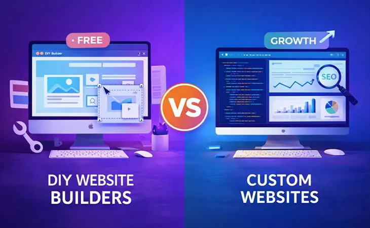
Your Fonts Are Talking – What Are They Saying About Your Business?
Fonts are silent salespeople. Before a customer even reads your words, the style of your typography tells them if your business is trustworthy, playful, corporate, or just… out of touch. That’s the psychology of fonts in branding and web design, and if you ignore it, you’re losing opportunities before the conversation even starts.
Take McDonald’s, for example. Their branding leans on bold, round, approachable typefaces that scream fun and fast. Compare that to a bank like Chase, which uses a sharp, sans-serif font to project stability, precision, and security. Same alphabet, two totally different stories.
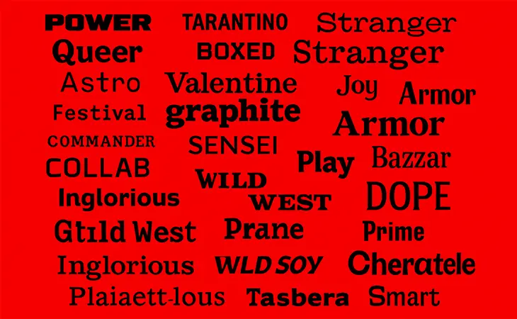
Serif Fonts: Classic and Trustworthy
Serif fonts (like Times New Roman or Georgia) carry history and authority. Those little “feet” on the letters make them feel established and traditional. Law firms, universities, and newspapers use them because they communicate trust and credibility.
But throw them on a playful bakery website? Instant mismatch. Instead of tasty cupcakes, you’ll look like you’re handing out tax forms.
Sans Serif Fonts: Modern and Clean
Think Helvetica, Arial, or Roboto. No frills, just sleek lines. Sans serif fonts dominate tech and startup spaces because they signal innovation, speed, and efficiency.
Google’s entire rebrand in 2015 moved from a serif to a clean sans serif – and that one subtle change made the brand feel more accessible and future-focused.
Script Fonts: Elegant or Playful (Handle with Care)
Script fonts bring flair. They can look elegant, like a wedding invitation, or playful, like a coffee shop chalkboard. But here’s the catch: they’re hard to read at scale. Use them as accents, not main text, or you’ll frustrate users faster than a slow-loading site.
Real-Life Example: Choosing the Wrong Font Hurts
We worked with a contractor once who had a bold, grungy display font on his homepage. It looked tough, but the guy specialized in clean, luxury bathroom remodels. Guess what? His leads thought he was a demolition company. Changing the font to a modern sans serif instantly flipped the perception. Within weeks, calls for remodels doubled.
That’s how powerful typography is.
Final Thoughts
The psychology of fonts in branding and web design isn’t some artsy afterthought. Fonts build trust, set tone, and influence buying decisions in the first seconds of a visit. Choose serif when you need authority, sans serif when you want modern, script when you want flair, and display when you need impact.
Because at the end of the day, your font isn’t just style – it’s strategy.
Further Reading
Want to dive deeper into the psychology of fonts in branding and web design and how design choices shape customer perception? These resources expand on the power of typography and visual identity:
- Rocket Web Designer – The Psychology of Color in Web Design: How Your Palette Impacts Sales
- Smashing Magazine – Practical Typography in Web Design
- Canva – The Ultimate Guide to Font Psychology
Have any questions?
Web Design Services
We are to help answer any questions you might have regarding web design & marketing.