
Responsive Web Design in Plain English
Responsive web design (RWD) is the practice of designing a website so that it automatically adapts to the screen size it’s being viewed on. Whether someone’s on a desktop, tablet, or smartphone, the layout, text, and images all adjust to fit cleanly and function properly.
In 2025, this isn’t a “nice-to-have”, it’s a baseline requirement. With users browsing on everything from ultra-wide monitors to old Android phones, if your site isn’t responsive, it’s effectively broken for a large portion of your visitors.
A responsive site improves usability, reduces bounce rates, and helps with SEO. More importantly, it tells your users you know what you’re doing.

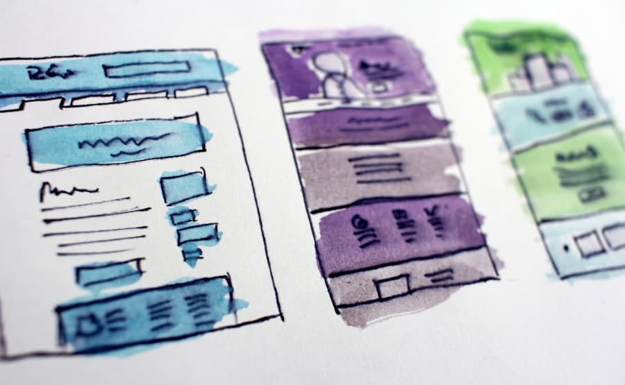
Responsive web design delivers the best version of the site for for the screen size
Whether you are using a smartphone, tablet, laptop, desktop, responsive web design delivers the best version of the website for the screen size of that specific device. This is the best way to ensure the user has the most optimal experience, which is especially true if it is a business website.
What Is Responsive Web Design?
Responsive web design, also known as RWD is a web design approach which allows a website to automatically adapt it’s content to various screen sizes. The reason why it’s crucial, especially in today’s time for your website to have responsive web design, is because of all the different devices with different screen sizes that are used to browse the web.
It’s important to understand that as of this writing, there are 12-15 different resolutions making up the majority of web traffic. Not employing a solid responsive solution can have negative consequences for your business because your goods and services won’t be displayed in the best light.
Fun Fact:
73.1% of web designers believe a non-responsive design is a top reason why visitors leave a website.
(Source: GoodFirms)
Examples Of Responsive Web Design:
Responsive web design, also known as RWD is a web design approach which allows a website to automatically adapt it’s content to various screen sizes. The reason why it’s crucial, especially in today’s time for your website to have responsive web design, is because of all the different devices with different screen sizes that are used to browse the web.


How Does Responsive Web Design Work?
The way a website is made responsive is by including screen specific styles in the CSS stylesheets. This means that the styles will change depending on the size of the screen, orientation or resolution of the device.
For example, on a website that has responsive web design the size of the text will change depending on the screen size, this makes it easier to read the text and makes it easier to accommodate the content on the page.
Another common example is using responsive design to switch to smaller versions of pictures or graphics made specifically for smartphones, which help significantly decrease load time & helps to display the site much faster.
Fun Fact:
Mobile devices account for over 58% of global website traffic.
(Source: Statista)
Is My Site Responsive?
Want to know if your site is responsive? There are a few of ways to tell, including viewing your site on different devices with different screen sizes. If the content is not displayed properly, for example if the images or text are too big / too small or the content is cut off then your website might not be fully responsive.
How to Test Responsive Web Design
If you’re not sure how your website looks across different devices, don’t guess — test it. Here are a few practical tools I use every day:
1. Chrome DevTools – Device Toggle
Every developer should know this one.
Shortcut:
Ctrl+Shift+M(or right-click → Inspect → Toggle Device Toolbar)Let’s you preview how your site behaves on dozens of screen sizes
Rotate between portrait/landscape, throttle network speeds, and simulate touch events
2. Google Mobile-Friendly Test
Straight from Google. It gives you a pass/fail grade and tells you what’s broken.
Bonus: It shows how Googlebot sees your site on mobile.
3. Responsively App
A killer open-source desktop app for responsive testing in real time.
View your site on multiple screen sizes side-by-side
Great for fast troubleshooting
Fun Fact:
Responsive sites are prioritized by Google’s mobile-first indexing.
(Source: Google)
Why Does My Business Need A Responsive Web Design?
Imagine you have a business where customers walk in and order a product. Now imagine if 30-70% of customers were unable to go through the door of your business to order a product, how would that affect your business? Responsive web design is the optimal foundation for any modern website, which is puzzling considering that many web design companies charge an extra fee to include it. At Rocket Web Designer all websites are custom-built from the ground up with responsive web design automatically, this ensures that your site can be properly viewed across almost all devices from the start.
- One website for all devices
- SEO boost
- No need to update multiple sites
- Lower bounce rates
- Improved conversion rates
- Site loads quicker on mobile devices
- Consistent style & branding
Final Thoughts
Responsive design isn’t some trendy design concept. It’s foundational.
Most business owners don’t realize how many potential customers they’re losing until they see it firsthand, someone clicks their ad, lands on their site, and can’t read the text or tap the menu. That’s a lost lead. And those losses stack up fast.
Testing your site across devices should be part of your regular maintenance checklist, just like checking your forms or updating plugins. It takes five minutes to catch a layout bug that could be costing you hundreds in lost revenue.
Whether you’re doing client work or managing your own brand, responsive design is how you stay relevant in a mobile-first world. If your site doesn’t adapt, your users won’t either, they’ll bounce.
Take it seriously. Check it often. And fix what’s broken before your visitors even notice.
Further Reading
If you’re learning about responsive web design, these articles will help you dive deeper into mobile UX, SEO impact, and best practices for 2025.
Rocket Web Designer – Top 10 Hidden Costs of Bad Web Design
Google Developers – Mobile-First Indexing Best Practices
Smashing Magazine – Responsive Web Design Best Practices
Have any questions?
Send Us A Message
We are to help answer any questions you might have regarding web design & marketing.


