What customers actually see
Picture this. A customer lands on your website for the first time. Before they read a single word, before they process what you sell or what you charge, something has already happened. In about fifty milliseconds, they’ve formed an impression of your business based purely on what they see. Not what you said. What it looked like.
That impression is your visual identity doing its work, for better or worse. This is Part 2 of The Brand Audit series, where Part 1 covered voice — how your brand sounds. This part covers the visual half: what people see, and the eight specific things they register before they’ve consciously decided anything.
Most owners think visual identity means the logo. The logo is one of eight things, and rarely the most important. Visual identity is the whole texture of how your business looks, and customers read all of it at a glance.
The fifty-millisecond judgment
The speed of visual judgment is well documented. A frequently-cited study referenced by the Nielsen Norman Group found that users form first impressions of a website in well under a second — and that impression colors everything they think afterward. Research from Google’s design teams found similar: visual complexity and “prototypicality” shape whether users judge a site as trustworthy almost instantly.
Here’s why that matters for a small business. You don’t get a second chance at the first fifty milliseconds. If the visual identity reads as cheap, dated, or confusing, the customer has already started looking for reasons to leave before they’ve read your headline. The visual sets the frame the words have to fight against.
The eight things customers actually notice
From auditing brand visuals across many small businesses, customers register these eight, roughly in this order of impact.
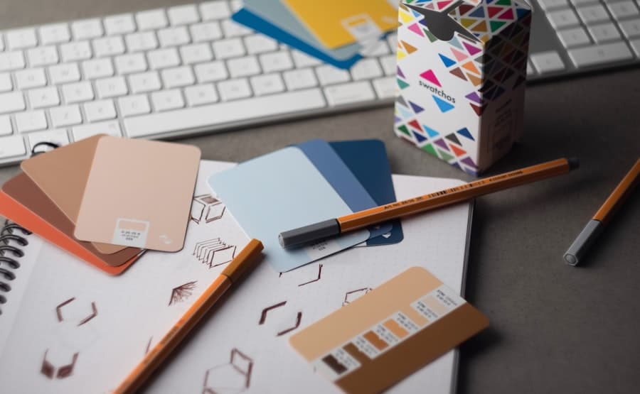
1. Color
Color hits first and hardest. It’s processed before shape or text. The wrong palette — muddy, clashing, or just generic — makes a business feel amateur before anything else registers. The right palette does quiet work: signaling whether you’re premium or budget, modern or traditional, calm or energetic. Most small businesses use too many colors. The strongest brands usually commit to one dominant color and one or two accents.
2. Typography
The fonts you use are a voice the customer hears with their eyes. A business using the default theme font reads as “didn’t think about it.” A business using three or four different fonts reads as chaotic. The brands that feel intentional usually pair one distinctive font for headlines with one clean, readable font for body text — and stop there.
3. Imagery and photography
This is where small businesses leak the most credibility. Generic stock photos of fake smiling teams in fake offices register as exactly what they are. Customers have seen those photos a thousand times on a thousand other sites. Real photos of real work, real people, and the actual business build trust that stock never will. The texture of “this is a real place run by real people” is almost entirely carried by imagery.
4. Spacing and layout
The amount of breathing room around elements signals quality more than almost anything. Cramped, cluttered layouts feel cheap and stressful. Generous spacing feels considered and premium. Customers can’t articulate this, but they feel it instantly — a crowded page makes the business feel like it’s trying too hard, while a spacious one feels confident.
5. The logo
Yes, it matters — but less than most owners think, and far less than they spend agonizing over it. A clean, simple logo that’s legible at small sizes does its job. An overcomplicated logo, or a low-resolution one that looks blurry, registers negatively. But customers rarely choose a business because of a great logo. They sometimes leave because of a bad one. The logo is a hygiene factor, not a differentiator.
6. Consistency across touchpoints
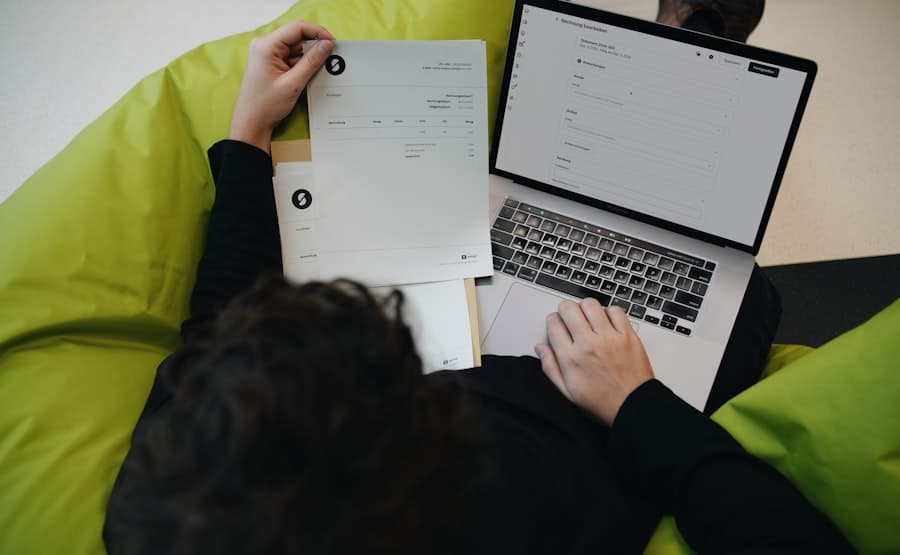
Does the website match the business card, the invoice, the Google Business Profile, the social media? When the visual identity holds together across every place a customer encounters it, the business reads as established and trustworthy. When the website is sleek but the invoice looks like a 1998 Word document, customers register the gap — usually without knowing that’s what they noticed.
7. Visual hierarchy
When a customer looks at your page, does their eye know where to go? Strong visual hierarchy guides attention — the most important thing is the most prominent, the next most important is next, and the path through the page is obvious. Weak hierarchy makes everything compete for attention, which means nothing wins, and the customer feels low-grade confusion they’ll blame on the business.
8. Detail and finish
The small things. Aligned edges. Consistent button styles. Images that aren’t stretched. Icons that match each other. None of these register individually, but collectively they’re the difference between “this business sweats the details” and “this business is sloppy.” And customers reasonably assume that a business sloppy with its visuals might be sloppy with the actual work.
The visual audit you can run this week
Open your website, your Google Business Profile, your social media, your business card, and your invoice template. Lay them out side by side. Then go through the eight:
- Color: Is there a consistent, intentional palette, or a random assortment?
- Typography: One or two intentional fonts, or a pile of defaults?
- Imagery: Real photos, or generic stock?
- Spacing: Room to breathe, or cramped?
- Logo: Clean and legible at small sizes?
- Consistency: Does it all look like the same business?
- Hierarchy: Does the eye know where to go?
- Detail: Aligned, finished, polished — or sloppy?
Whatever scores worst is where to start. For most small businesses, it’s imagery (too much stock) or consistency (the touchpoints don’t match). Fix the worst one first.
Why this connects to everything else
Visual identity isn’t decoration. It’s a trust signal that fires before words. The customer who feels, in the first fifty milliseconds, that your business looks credible is far more receptive to everything that comes after — the headline, the offer, the proof. The one who feels the opposite is looking for the back button.
This is the same reason building a real brand doesn’t have to be expensive — most of the eight things above cost attention, not money. And it’s why the visual side has to match the voice that passes the five-second test. Look and voice are two halves of the same impression.
What’s coming in Part 3
Part 3 of the brand audit moves to content — what your brand actually says when it has nothing to sell. The substance underneath the voice and the visuals, and how it shapes whether customers see you as an authority or just another option.
When the visual identity needs real work: brand identity, color systems, typography, and the consistency layer across every touchpoint runs through our company branding service. The website that carries it lives in our web design service.
Final Thoughts
Your customers judge your business visually before they judge it any other way, and they do it faster than they can think. The eight things above are what they’re reading in that first instant. Most of them cost nothing but attention to improve.
Open your touchpoints this week. Look at them the way a stranger would in the first half-second. Fix the thing that looks worst. Then the next. One change at a time, the whole visual impression sharpens — and the words finally get a fair hearing.
Further Reading
If you want to dig into the research behind visual identity and first impressions, here are reputable sources worth bookmarking:
- Nielsen Norman Group – First Impressions and Time on Page
- Google Research – Visual Complexity and First Impressions
- Adobe – Brand Identity Fundamentals
- Smashing Magazine – Typography and Visual Design
- Harvard Business Review – The Elements of Value