Let’s stop pretending ecommerce success is a mystery.
It’s math, psychology, and fixing the stuff you’ve been overlooking.
A 15% sales lift sounds big, but it’s actually the low end of what’s possible when you clean up the messes that customers trip over every single day on your site.
Most ecommerce stores don’t need more traffic.
They need fewer reasons for a shopper to hesitate.
And hesitation is what kills conversions.
Let me break the whole thing down in a way that actually helps you. No magic hacks, no “secret tips” garbage, just the fixes that consistently move revenue.
Stage 1:
Patch the Silent Leaks That Are Draining Sales (You Don’t Even Know They’re Happening)
Here’s the uncomfortable truth most store owners don’t want to admit:
Your site is losing sales in places you never see.
Customers click, browse, compare, add to cart, then vanish, and unless you’ve run heatmaps, session recordings, or deep funnel analytics, you have no idea where the exit points are.
Good news?
15% more sales comes from fixing the basics, not reinventing the entire store.
Let’s go piece by piece.
1. Your Product Pages Need More Depth (Most Are Too Shallow)
Product pages are where the sale actually happens — yet almost every small ecommerce site treats them like an afterthought.
Here’s what actually boosts conversions:
✔ Better photos
Not just a couple angles.
You need:
close-ups
lifestyle photos
scale references (so people understand size)
textures
real environments
human interaction shots
Humans buy what they can visualize.
✔ Strong benefit-driven descriptions
People don’t buy features.
They buy outcomes.
Instead of:
“100% cotton hoodie”
Try:
“Stays soft after 100+ washes, breathable but warm, and doesn’t stretch out in the sleeves.”
Sell the experience.
✔ Comparison notes
Help the customer choose between variations.
Example:
“This one is softer, this one is more durable, here’s who each is best for.”
This alone increases conversions because it removes decision anxiety.
✔ Bullet points that answer real objections
- How long does it last?
- How does it feel?
- Will it fit me?
- What makes it different from cheaper versions?
- Does it work with X or Y?
If your description isn’t answering the questions in someone’s head, the sale dies right there.
2. Clean Up Your Add-to-Cart Flow (Friction = Abandoned Carts)
If clicking “Add to Cart” feels like a chore, you’re done.
Shoppers want two things:
predictability
speed
Here’s what fixes the friction:
✔ Don’t surprise customers with extra fees at checkout
If shipping is expensive, show estimates before checkout.
If taxes vary, give a range.
If there’s a minimum for free shipping, display it clearly.
Surprises kill trust instantly.
✔ Reduce the number of clicks
If your cart → checkout → payment flow has more than 2–3 steps, tighten it up.
Every extra click = a percentage of customers gone.
✔ Eliminate forced account creation
Nothing inflates abandon rates more.
Guest checkout is mandatory.
✔ Remove clutter from the cart
No popups, no “you might also like” distractions at the wrong moment.
Let customers finish their purchase without detours.
Stage 2:
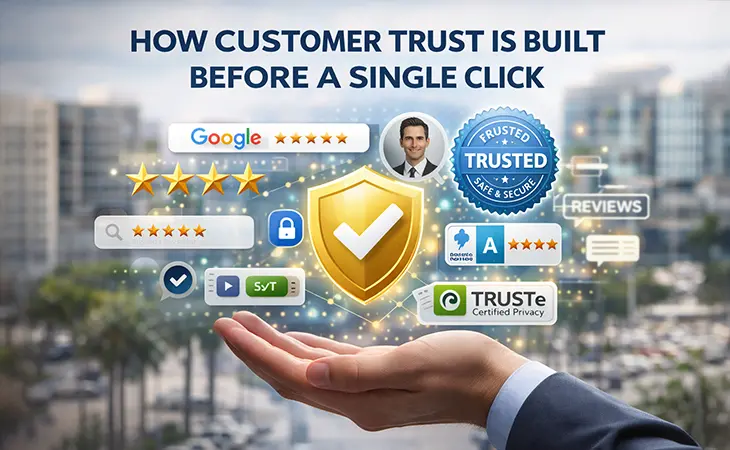
Build Trust Faster – Because People Don’t Spend Money When They Feel Uncertain
You want to know why people leave your website without buying?
Because something didn’t feel right.
Not because your product is bad.
Not because your price is wrong.
Not because they weren’t ready.
They didn’t trust the experience.
Trust equals money in ecommerce.
You can have a cheaper competitor, but if you’re more trustworthy, you win every time. We as shoppers pay a higher price for trust.
Here’s the trust formula that actually works.
1. Show REAL reviews and REAL customer content
The days of “five stars, love this!!” reviews are dead.
Customers want:
- photos
- videos (even short ones)
- longer explanations
- what they liked AND disliked
- context (“used this for my kid’s science project”)
Video reviews alone can increase conversions by double digits.
If you don’t show proof, your competitors will.
And customers will go to whoever feels more legitimate.
2. Show your face – literally
Customers want to know who they’re buying from.
A simple block like:
“Meet the founder: John Smith
Started CheapGlasses.com after overpaying for glasses himself…”
…makes a massive difference.
People buy from people.
You’re not Amazon.
You’re a brand.
Act like one.
3. Make your return policy impossible to misunderstand
A confusing policy = guaranteed lost sales.
Your return policy should say:
- how long the customer has
- what can be returned
- how to initiate a return
- who pays for shipping
- how long refunds take
- exceptions
Clarity creates confidence.
Confidence creates sales.
Stage 6: Email Flows That Make Money Automatically
This might be the single most overlooked revenue source in ecommerce.
Email is not old school. Email is your most profitable channel if you set it up correctly.
You want 15% more revenue? This is one of the easiest ways to get it.
1. Abandoned cart flow
Must include:
email within 30 minutes
email within 4 hours
email the next day
optional final reminder on day 3
If you do not have this running, you are throwing money away.
2. Thank you flow with cross sell
After a purchase, your customer is warm and trusting.
Suggest the accessory, the version upgrade, or the related item.
Do not be pushy.
Just be helpful.
3. Win back flow
People who have not purchased in 60 to 90 days get:
reminder
helpful advice
new release announcement
exclusive offer
This brings old customers back without spending ad money.
4. New subscriber welcome series
Teach your brand story.
Show your best sellers.
Show your social proof.
Give something small to encourage the first order.
Before We Go Any Further: This Is Where Stores Either Level Up or Stay Stuck
Alright, you patched the leaks, cleaned up the product pages, and made checkout less annoying. Good start. But if you really want to increase sales 15% on your ecommerce site, now we move into the psychological pressure points that actually make people buy.
Most ecommerce owners never touch this part. They keep chasing traffic without understanding how shoppers think. This is where you separate yourself from mediocre online stores.
Let’s keep going.
Stage 3:
Use Pricing Psychology That Makes Buying Feel Easier
Raising conversions is not always about lowering prices. It is about making the price feel comfortable, reasonable, expected, and justified.
Here is how you do that.
1. Show a comparison anchor
People need reference points.
If your product is 49, show:
- Main price: 49
- Compared to: 69 or typical retail
Not fake numbers. Real comparisons. Real value.
Anchoring gives the brain something to compare against so the price feels fair.
2. Add a small upsell option next to the main one
When people see two versions of the same product, they almost always choose the middle option.
That is the decoy effect in action.
Example:
Basic 39
Plus 49
Premium 79
The 49 option will outsell the 39 because it feels like a smarter deal.
3. Remove expensive looking shipping surprises
If shipping is high, soften it with:
free shipping over a certain amount
order value progress bar
flat rate shipping
The moment people feel blindsided, they bail.
4. Offer fast, clear payment options
Apple Pay, Google Pay, Shop Pay, Stripe Link.
The faster the checkout, the fewer abandoned carts.
People do not think about price as hard when the checkout is effortless.
Stage 4:
Increase Your AOV Instead of Always Chasing More Customers
If you want to increase sales 15% on your ecommerce site, you do not always need more customers. You need your existing customers to buy a little bit more.
Here is how.
1. Smart bundles that feel natural
Not random bundles.
Logical bundles.
Examples:
- toothbrush plus travel case
- candles plus wick trimmer
- skincare plus applicator
- lenses plus anti fog spray
- t-shirts plus matching hoodie
People love bundles because they feel like they are getting a deal, even if the discount is small.
2. One click add-on at checkout
Make it stupid simple.
A small accessory.
A refill item.
A protective case.
Low priced add-ons convert at ridiculous rates because the hard part, the initial purchase, is already done.
3. Loyalty or repeat purchase incentives
Simple things like:
- buy two, get a small discount
- points
- simple punch card systems in the backend
- repeat customer coupons automatically emailed
Repeat customers spend more. Always.
Stage 5:
Improve Your Mobile Experience or Forget Growth Entirely
Over 70% of ecommerce traffic is mobile.
If your phone experience is sloppy, cramped, or slow, you are burning money.
Here is what actually matters.
1. Make the first screen simple
One product photo.
Title.
Price.
Add to cart button.
Nothing else.
No clutter.
No huge description blocks taking up space.
2. Use sticky add to cart buttons
Customers should never have to scroll to find the CTA.
Sticky buttons increase conversions significantly because the option to buy is always visible.
3. Fix fat finger issues
Spacing between elements needs to be larger.
Buttons need to be tall and easy to tap.
Menus cannot be tiny.
Everything should feel comfortable, not cramped.
4. Speed matters
Three seconds. That is the limit.
If your mobile site is crawling, people do not even stick around long enough to think about buying.
Compress images, remove unnecessary scripts, and use lighter layouts.
Stage 6:
Email Flows That Make Money Automatically
This might be the single most overlooked revenue source in ecommerce.
Email is not old school. Email is your most profitable channel if you set it up correctly.
You want 15% more revenue? This is one of the easiest ways to get it.
1. Abandoned cart flow
Must include:
- email within 30 minutes
- email within 4 hours
- email the next day
- optional final reminder on day 3
If you do not have this running, you are throwing money away.
2. Thank you flow with cross sell
After a purchase, your customer is warm and trusting.
Suggest the accessory, the version upgrade, or the related item.
Do not be pushy.
Just be helpful.
3. Win back flow
People who have not purchased in 60 to 90 days get:
- reminder
- helpful advice
- new release announcement
- exclusive offer
This brings old customers back without spending ad money.
4. New subscriber welcome series
Teach your brand story.
Show your best sellers.
Show your social proof.
Give something small to encourage the first order.
You are building trust at the exact moment someone is open to hearing from you.
Stage 7:
Use Urgency The Right Way So Customers Take Action Without Feeling Pressured
Urgency works, but only when it feels real. If it feels fake, customers leave. People today have seen every cheap countdown timer and fake scarcity trick on the internet. You cannot fool anyone.
Here is what actually works.
1. Real estimated sell-out warnings
If certain products regularly sell out, tell people.
Example.
“This style usually sells out every 14 days.”
Be honest. Customers respect transparency.
2. Low stock indicators that are accurate
If you really have 5 left, show it.
If you have 200 in the warehouse, do not lie.
Real urgency builds trust and improves conversions.
3. Order cutoff times
Instead of saying “limited time,” you say:
“Order by 2pm ET to ship today.”
This is real and measurable.
People respond to clarity more than pressure.
4. Seasonal or temporary variations
Limited edition colorways, holiday scents, seasonal flavors.
Customers buy faster when they know something will not be available in three months.
Stage 8:
Fix Your Navigation and Site Structure So Customers Do Not Get Lost
A confusing site destroys sales.
If your menu feels like a maze or if your categories are unclear, people give up.
Here is what tight structure looks like.
1. Simple, predictable menu layout
Your menu should have:
- Shop
- Best Sellers
- New
- Categories
- Customer Service
- About
No complicated labels.
No hidden dropdowns inside dropdowns.
2. Best sellers section on the homepage
This always converts.
Customers want social proof.
Highlight the winners.
Let your site guide customers to what most people are already buying.
3. Filter options that reduce frustration
If you sell items with sizes, colors, shapes, or variations, customers need clean filters.
Make them obvious.
Make them easy.
Make them mobile friendly.
4. Search functionality that actually works
Most ecommerce searches are painful.
Customers misspell a word and get zero results.
They type “blue shirt” and get everything except blue shirts.
Clean search wins money.
Stage 9:
Rescue Slow Moving Products Instead of Letting Them Rot
Every ecommerce store has products that do not sell.
You do not need to throw them out.
You just need to position them better.
1. Improve the photography first
Poor photos kill good products.
Put the product in someone’s hand.
Show it in context.
Show scale.
Show detail.
2. Rewrite the description with real benefits
Do customers even understand the purpose of the item?
Spell it out.
Instead of:
“Premium water bottle”
Try:
“Keeps drinks cold for 12 hours, fits in car cup holders, and does not sweat on your desk.”
Make it real.
Make it useful.
3. Pair slow sellers with strong sellers
Bundle them.
Headline them in cross sells.
Put them at the bottom of popular product pages.
Give the slow sellers a ride.
4. Add a story
Why was this item created?
Who is it for?
What problem does it solve better than other items?
People love stories.
Stories sell.
Stage 10:
Show Reassurance Throughout the Entire Funnel
Reassurance is not just trust.
It is the constant reminder that buying from you is safe, simple, and smart.
1. Badges that actually mean something
Not fake “100% secure” boxes.
Real badges.
Trustable processing logos.
Clear accepted payment types.
2. Micro copy that reduces fear
Short lines near the checkout that say:
“Easy returns.”
“Fast support.”
“Ships quickly.”
Tiny phrases.
Big impact.
3. Delivery expectations everywhere
On product pages.
In carts.
On checkout.
Example.
“Ships in 1 to 2 business days.”
Customers calm down when they know exactly what to expect.
4. Live chat or fast support options
People want answers immediately.
You do not need full time staff.
Even quick automated responses followed by real support help customers stay on the page.
Real Examples of 15% Gains
Here are actual examples I have seen repeatedly.
1. Product page clarity upgrade
A brand improved photos, rewrote descriptions, added customer images, and clarified who the product was for.
Result.
17% jump in conversions in two weeks.
2. Checkout cleanup
Removed forced account creation.
Enabled Apple Pay and Stripe Link.
Reduced fields.
Result.
12% immediate lift, 19% total over a month.
3. Email flow rebuild
New welcome series.
New abandoned cart sequence.
New post purchase flow.
Result.
25% more revenue from email alone.
4. Navigation restructure
Simplified categories.
Made best sellers a main menu item.
Result.
Customers found products faster and conversions climbed 15% without extra traffic.
These are real world results that come from tightening the funnel, not chasing miracles.
Final Thoughts
If you want to know how to increase sales 15% on your ecommerce site, the answer is not magic, luck, or a secret that only gurus know. It comes from cleaning up friction, earning trust, building clarity, raising average order value, improving your mobile experience, and guiding customers smoothly from interest to checkout. Small upgrades stack together and create meaningful revenue increases. When your site feels easier to use, customers spend more money, and that is the part most ecommerce owners overlook.
Further Reading
If you want to explore more strategies that strengthen your online presence and improve customer experience, here are helpful resources:
- Rocket Web Designer – The Most Common Website Problem No One Talks About
- Rocket Web Designer – Your Business Grows When You Do
- Shopify Blog – Ecommerce Conversion Strategies
- BigCommerce – Conversion Optimization Techniques
Ready to Fix Your Website for Good?
Let's Grow Your Business Online
From websites to automation, we’ve helped 100+ business owners grow online


